Professor T. Halberd
6 years ago
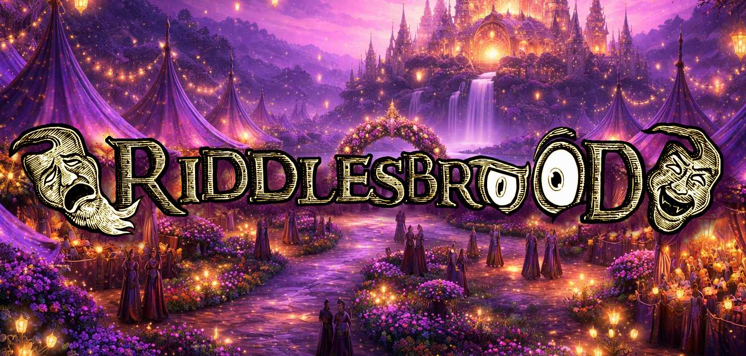
The Riddlesbrood Logo
I am Professor T. Halberd of Extempory College—scholar of ancient linguistics and human flatulence, a man burdened with knowledge few dare to seek. And yet, even I was unprepared for what I recently uncovered. It began with a pattern; one I could not ignore. Scattered across gas station pumps throughout New Jersey and Pennsylvania, I found cryptic stickers—affixed to vending machines, restroom doors, even the dim-lit corners of convenience stores. The symbol they bore was striking, evocative, almost hypnotic. It gnawed at the edges of my mind, demanding inquiry. My research led me to a revelation both strange and troubling: this was the sigil of Riddlesbrood Theater.
Thus, I set out to unravel its secrets. This article shall attempt to grant you, dear reader, the capacity to comprehend its true nature. A single viewing of this symbol has the power to alter your consciousness—perhaps even your very state of mind! Alas, as with all imposing insignia, mortals are forever changed by the symbols they gaze upon. Riddlesbrood’s unforgettable logo is no exception.
Now, some have remarked that concentrating on the symbol for prolonged periods sharpens one's intellect and enhances any latent psionic abilities. This majestic mark has also been associated with authority, ferocity, immortality and wickedly funny jokes.
The Riddlesbrood Touring Theater Company takes its name from its arcane founder, and in addition the company’s logo derives from his ineffable symbol, known as the ‘Harken’. Although little of it is known and even less verified, it is said that the logo originates from the homeland of this wandering founder and his ancient traditions. To aid in your understanding of it, we have included several different images of the Riddlesbrood logo. Some of the different forms of it you have likely seen on playbills, business cards, posters or on an episode of Ancient Aliens. Often it has been described in the following manner: “a figure suspended as a puppet, three tines at its left hand, three spheres at its right.”
Around the circumference of the logo appears a series of faces or masks
These have been translated as meaning “He who grins wins.” Which, some have said, indicates the troupes’ objectives in entertaining their crowds and perhaps even objectives of an occult nature beyond that of making a tidy profit. Evidently, a perplexing mythos has given rise to the very essence of Riddlesbrood’s brand. Some of this is known from the enigmatic “Greatest Brochure in the World” an advertisement which is often given to prospects looking to book one of the troupe’s various entertainments. In that verbose brochure the following passage appears; which gives hint to the symbol’s origin….
“Harken the way and the form.” It reads.
“His riddle was not outlandish at all but picturesque—a play on worlds. Tis a floorplan, a simple map and its name is ‘Harken’. Riddlesbrood’s symbol is but the cartographic expression of a place. I look for landmarks everywhere and find them. To my right, there are swamps, with three large lakes. To my left, three rivers merge from the sea and run towards the mountain’s base—the three tines. The headlands around the island, hooked just as the sigil on the company’s letterhead—be it God or graphic designer—the logo [was] a land!”
The emblem often enthralls the eyes! Being a combination of be-riddling visual imagery, the logo clearly serves two purposes for the troupe. Firstly, it infers to the observer the name of the company and it creates a visual representation that identifies the business. Secondly, it is the very first impression most have of Riddlesbrood and clearly, it is intended to create a powerful mnemonic association connected to an audience’s memory.


But why the colors?
As far as color is concerned, often the ‘Harken’ logo is portrayed using a golden yellow. Yellow, being an opulent hue, calls to mind the golden treasures of yore. Furthermore, yellow is bright, causing it to stand out even in busy surroundings. As the actors are also the brand ambassadors, they have this company sigil proudly emblazoned on their purple t-shirts which they wear to each and every event. When a customer sees this logo, reader, they invariably experience a mystic feeling that immediately brings to mind the bizarre brand of comedy associated with the famous troupe.
Therefore, my friend, if you find yourself strolling down Main Street, mindlessly scrolling the internet, or dining at an establishment of supposed refinement—should your eyes fall upon this infernal symbol, know this: something may have already stirred within you! A door, once shut, now creaks open in the depths of your subconscious, whispering invitations you cannot unhear. And—blast these adhesives!—as I struggle to remove yet another of these wretched stickers from this cursed restroom wall, I see the eyes of passing patrons fixed upon me with suspicion, perhaps even pity. But heed my words, not their judgment! The door in your mind will not close on its own—it must be shut properly, and there is but one way! You must see one of their performances! Only then will you understand. Only then will you be free!


